We want it to look good, be effective and reflect our image! The logo is an important part of your company’s visual identity, whether large or small. Here are our tips for getting on the right track when it comes to designing or modifying your logo.
The importance of design
We recommend that you have your logo designed by a graphic design agency or professional (Psstt… we do that too at PointPub Média!). It’s best to avoid buying it cheaply from sites that sell “pre-made” ones. First, it’s not original. Secondly, there’s always the risk that another company will buy the same one… it has to be unique!
The basics
Look at what the competition is doing. Look at what’s out there, then note what you like and don’t like about others. This will provide a good basis for the graphic designer who will be doing the work. He or she should also ask you questions to make sure he or she understands your needs and tastes.
If you’re a lesser-known company, opt for legible typography that’s as uncluttered as possible.
A logo shouldn’t be an illustration. It should be legible on all types of print: business cards, posters, embroidery, etc. But it shouldn’t steal the show. It should not, however, steal the show in the graphic context of a document layout.
The different versions
It’s important to know about your own logo. From one agency to another, we will always need the same types of files and information. Make sure you have all versions of your logo, especially the original vector (.ai) version (it has to be!) and the JPEG and PNG versions.
Your logo should always respect proportions and layouts, i.e. make sure it’s not too stretched on one side, for example. You should have an abbreviated, color, black & white and negative black & white version. If you have a pantone color reference, that’s even better… all in the best of worlds, of course!
Its evolution
You love your logo, and it’s stuck with you for several years now… well, maybe it’s time to modernize it. Without changing it completely, a little makeover might be in order…

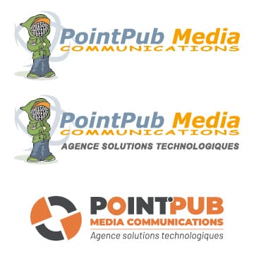
PointPub Média’s logo has undergone a few revisions, including last year…
For more international examples, look at the logos of Nike, McDonald’s, Apple… which no longer even mention the company name. The brand image is strong!
In short, don’t neglect your logo, make sure it’s original, unique and professionally designed… that way you’ll avoid any copyright or printing problems! Contact us if you’d like to discuss your logo!


