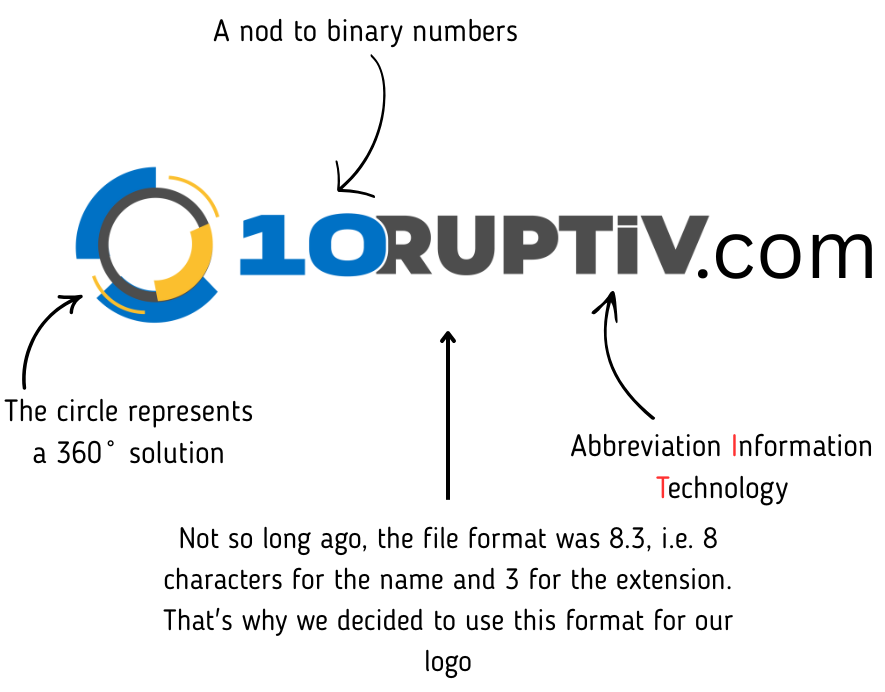
A new name signifies a new visual identity. Early on, through a video call and messages on our discussion channel, the boss, who dreamt of this all night, initiated several discussions about crafting our new logo. Our brilliant graphic designer presented us with various models. Yet, nothing quite resonated; they still didn’t capture our essence. Perhaps we were searching too far? Because the answer had been right under our noses all this time. After all those reflections and meetings, we finally decided to keep the circle, as it best represents us – a 360˚ solution.
But the design journey didn’t stop there! Through this process, we also decided to incorporate a few nods in our new logo – references to our previous visual identity and nods to technology. Why not take the opportunity to personalize our emblem as much as possible? Allow us to elaborate on our vision.
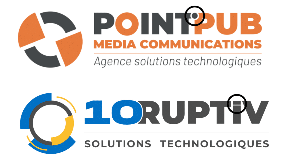
First and foremost, we wanted to retain the dot in the letter “i” as we did in our old logo. We considered integrating it into one of the letters before or after, but visually, the composition wasn’t quite appealing. Sometimes, it’s better to leave things as they are. Speaking of the letter “i,” did you notice that we can find the abbreviation “IT” in our new name? A clever play on words, don’t you think? 😉 We’re quirky like that!
The development of the logo was, of course, the next step after finalizing our new name. The word ‘disruptive’ frequently appeared in our discussions. By definition, disruption carries a negative connotation. However, as with everything, there’s a way to spin it positively. Positive disruption is when the upheaval saves money, enhances organizational efficiency, and increases flexibility – perhaps all three at once! You see where I’m going with this. We are your positive disruption. But we didn’t want to simply write the word ‘Disruptive,’ that’s too simplistic! Our president had a stroke of genius in wanting to integrate the number 10. It’s visually more captivating and also serves as a nod to binary numbers, of course!
Did you know that not too long ago, the maximum accepted character count for a file name, like in Microsoft Word, was just eight? By structuring our name this way, 10RUPTiV pays homage to those infamous eight characters. It’s all in the small details.
Infrastructure, Development, and Web are our specialties, but we didn’t want to solely emphasize that. That’s why we chose “Technological Solutions.” It’s clear, understandable – it encapsulates what we offer: technological solutions for everyone, encompassing all other spheres of technology. Of course, this is just a summary of the evolution of our new identity. It was a process spread over several weeks. Nonetheless, it brings us great joy to share it with you. 😊